Redesigning the Online Store
This project aims to redesign the online store of MCA Chicago in order to increase website traffic and overall store sales. The scope of this project is to design an intuitive and engaging online shopping experience for users for faster checkout.
Duration: 2 week design sprint
Tools: Sketch, Adobe suite, Invision
Deliverables: High fidelity Prototype for Ecom website
Methodology: Contextual inquiry, Feature Prioritization, Card sorting, Content hierarchy
RESEARCH & LEARN
About MCA
Museum of Contemporary Art Chicago is one of the nation’s largest museums dedicated to exhibit and preserve contemporary visual culture through the medium of art. Located in the heart of downtown Chicago, the MCA boasts a gift store, bookstore, Marisol Restaurant, a 300-seat theatre, and a sculpture garden with panoramic views of Lake Michigan. The MCA Store is an ever-changing landscape of new ideas, resourceful innovation, and great design from artists and designers throughout the world.
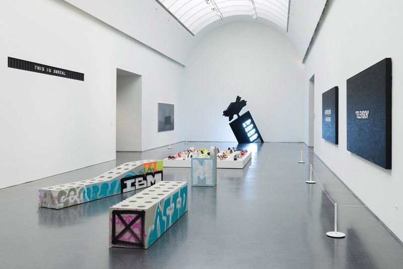
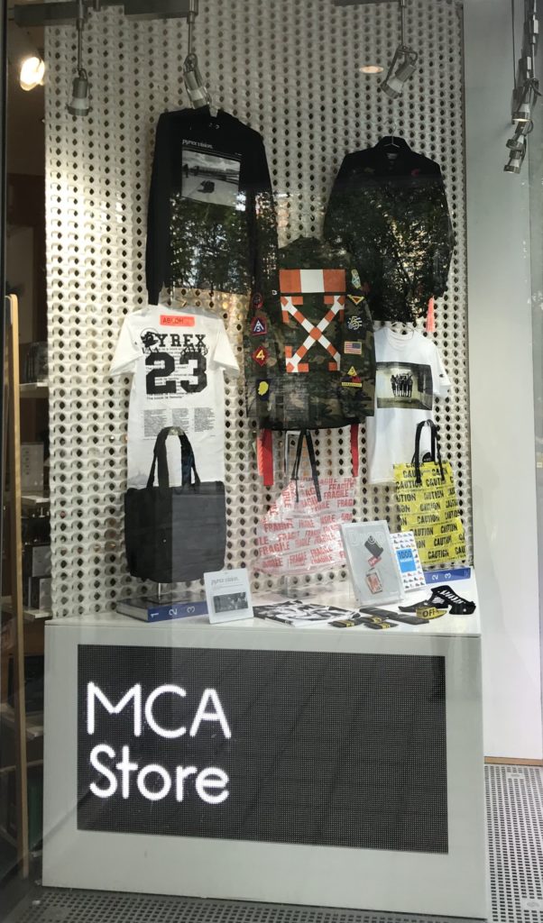
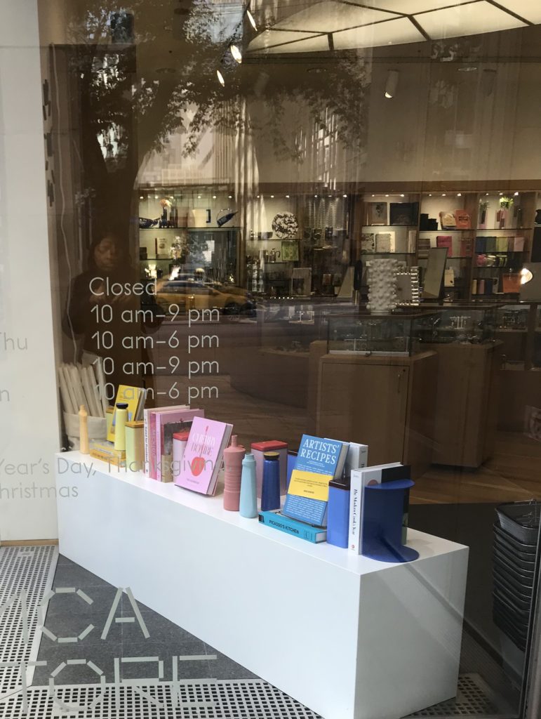
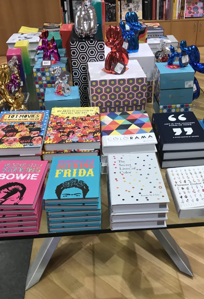
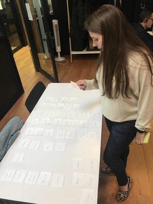
Store Visit
Data Synthesis

Key Takeaways
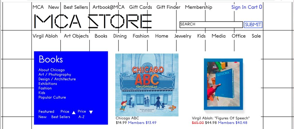
MCA needs to have consistency in their Store and E-Com Layouts and navigation patterns respectively.
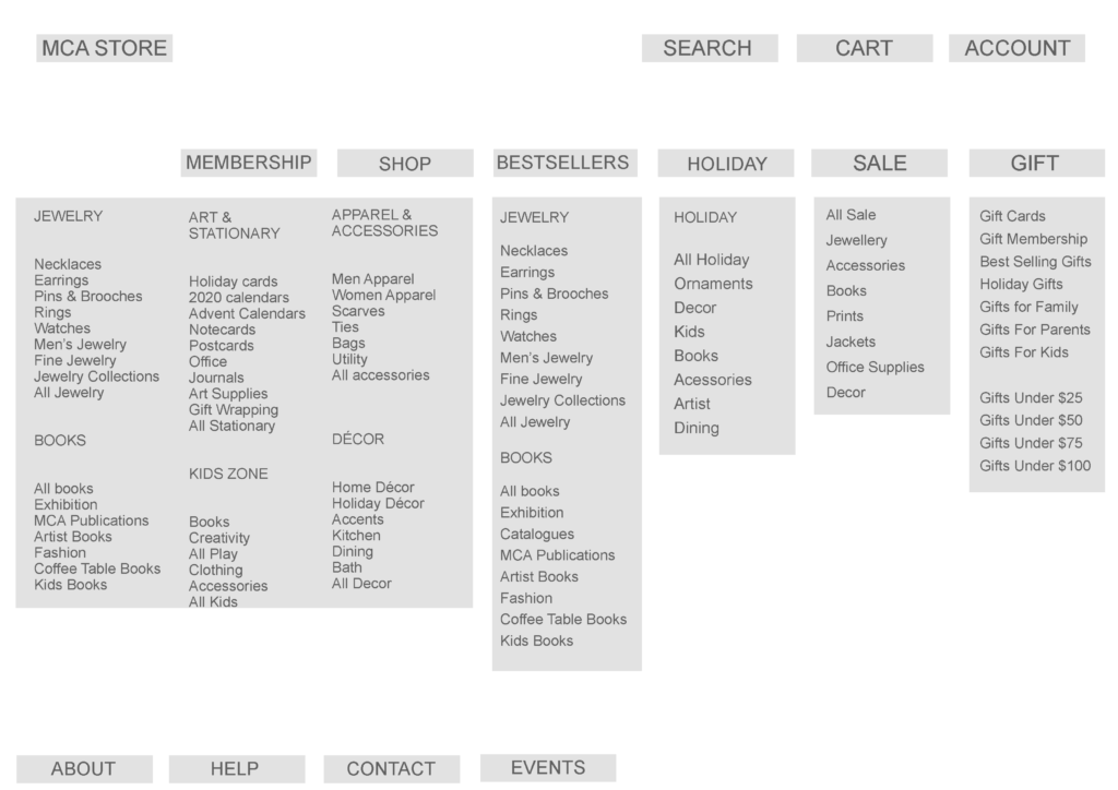
The Bestseller category of Jewelry and Books is an integral part of Sales.
The MCA store has contemporary interiors and the website also needs similar design language for consistency.
The Artist and Seasonal collections were major POS in the store and need higher placement in content hierarchy.
The membership is an important Feature to engage more users and promote art and culture in the community.
The Shoppers mostly buy gifts/ souvenirs for their friends and family from the MCA Store.
Competitive Landscape
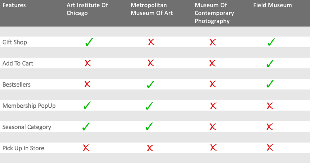
Competitive Analysis
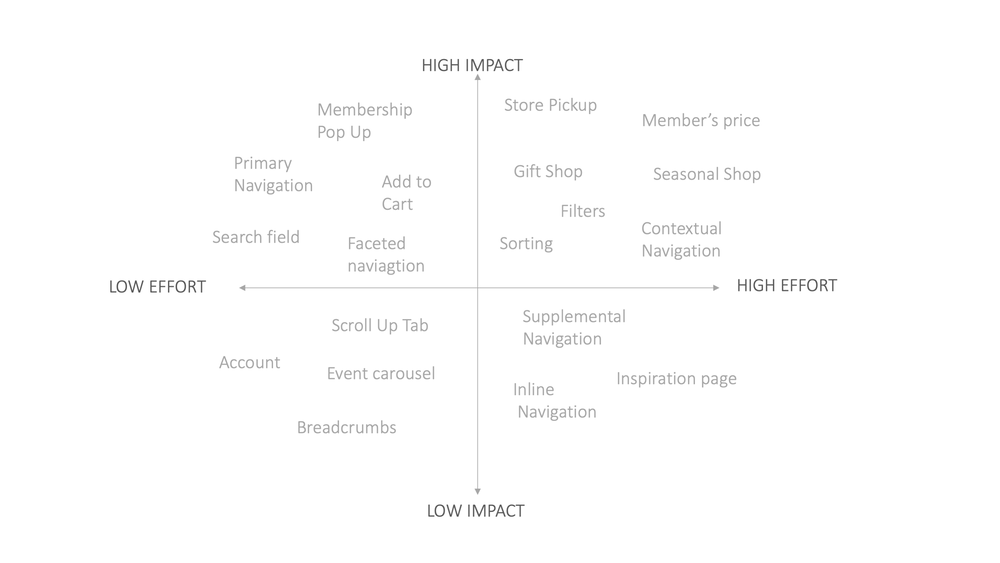
The Gift Shop feature is an exclusive tab that lets the user search for suitable gifts for friends and family. It is a Prime navigation in a few Museum Stores.
Add to Cart/Bag feature in the product listing page is a quick way to shop which gives user delight to continue shopping. Very few comp stores had this feature available.
Bestsellers in the Primary navigation guides the users to shop by giving recommendations. Few of the stores have this feature available on their Ecom website
Membership popups are the medium to engage and involve visiting customers. Few stores have subscription popups.
Seasonal POS in stores and E-com website engages new users in shopping experience. Few of the stores have seasonal category for their websites.
Pick up in store is a new opportunity for the Store to give great shopping experience to their users. None of the Museum stores have this feature available
Comparative Analysis
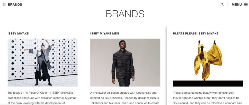
Issey Miyake is a Japanese designer who is known for his clean and minimal designs. The simulation of his ideology in the website gives clarity to the user while navigating.
Nike website has clear navigation bars and a clean menu bar to let the user make easy decisions about their category and purchase seamlessly.
ASOS is an European online shopping brand that lets the user take over and feel the freedom of owning the shopping experience through their easy navigation controls.
BUILD
Problem statement
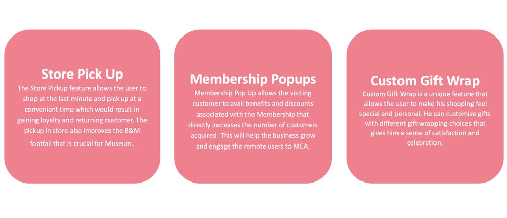
Museum of Contemporary Art Chicago Store has extended an Ecom platform for the users to shop online for Artistic and designer merchandise. The user needs a way to shop quickly for a reasonably priced gift in the nick of time. He needs a way to customize his gifts and shop seamlessly for last minute shopping decisions.
Persona
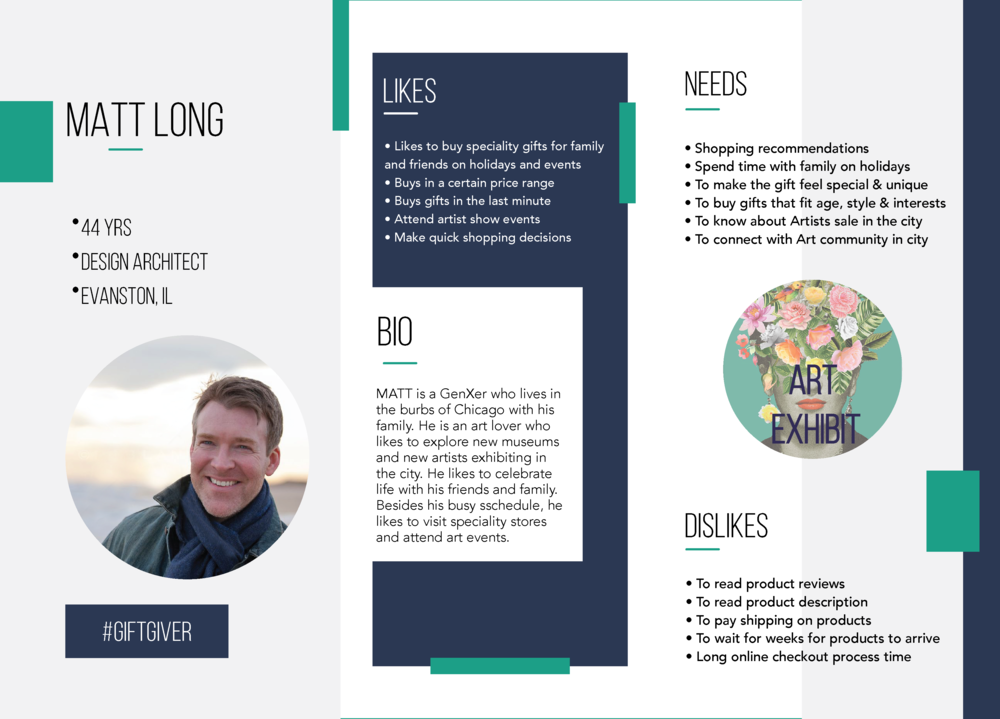
User Goals vs. Business Goals

Feature Prioritization Matrix
New Design Features
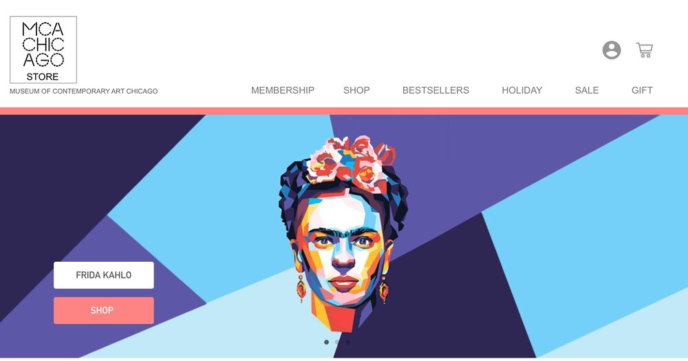
Current MCA Webpage
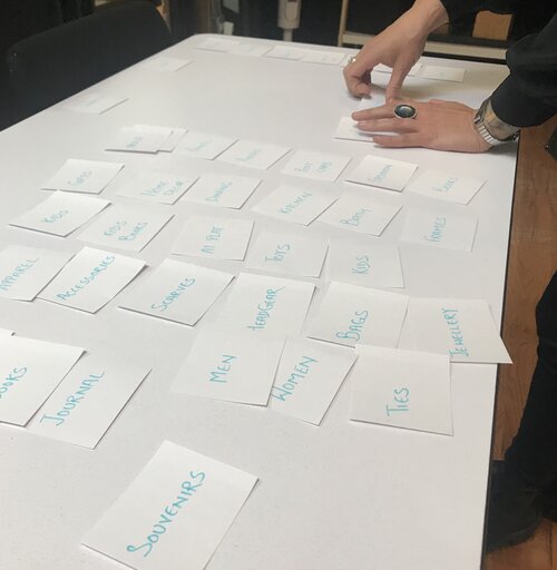
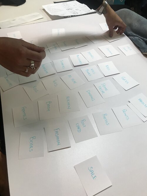
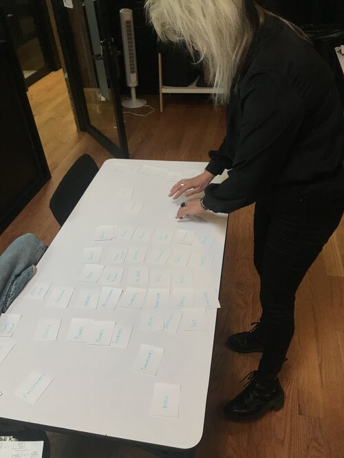
Open Card Sorting
Card Sorting Analysis
The users were able to identify some clear categories for Primary Navigation.
The users were struggling with the placement of member and account cards.
The users were finding difficulty in placing the Artist card in a specific category.
The users placed Gifts Card as primary navigation & identified it as one of the important features.
The users were having difficulty in grouping Fashion, Apparel, Men, Women and Kids Card.
Revised Content Hierarchy
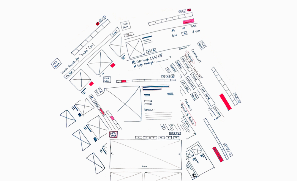
Sketching
MEASURE & TEST
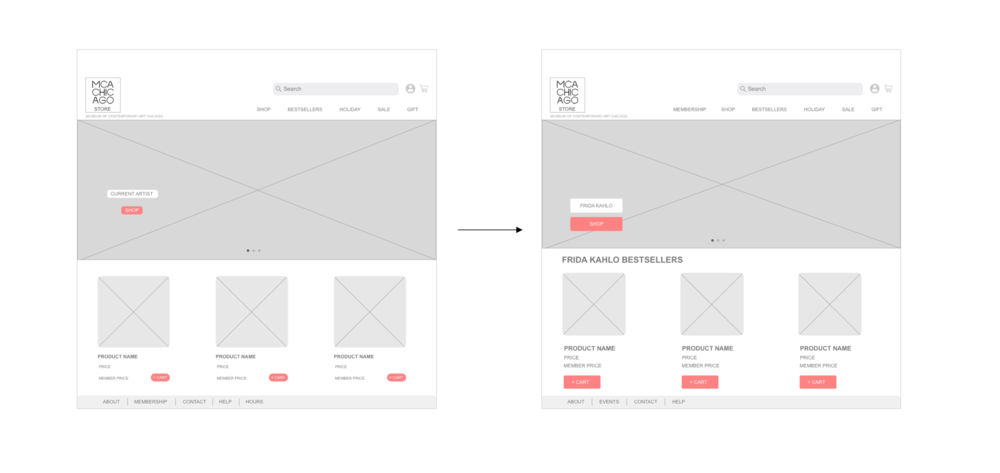
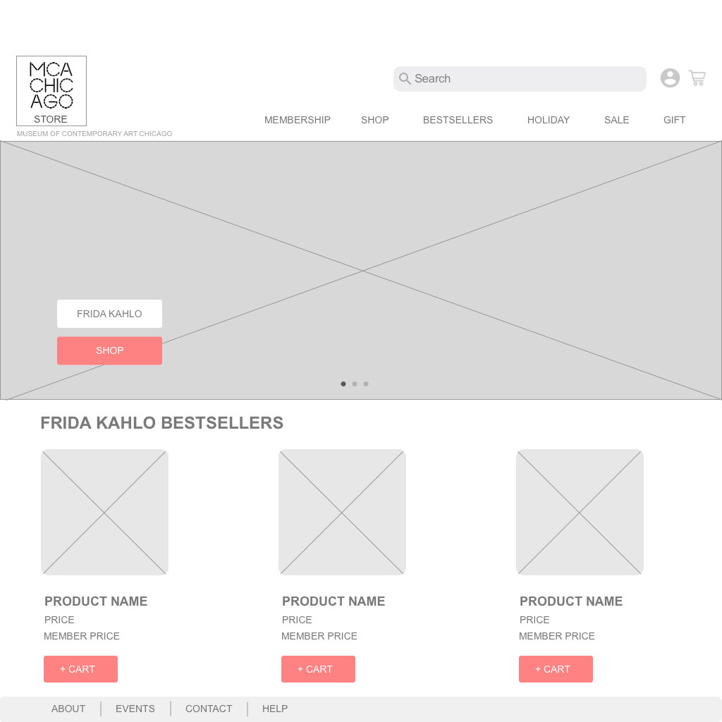
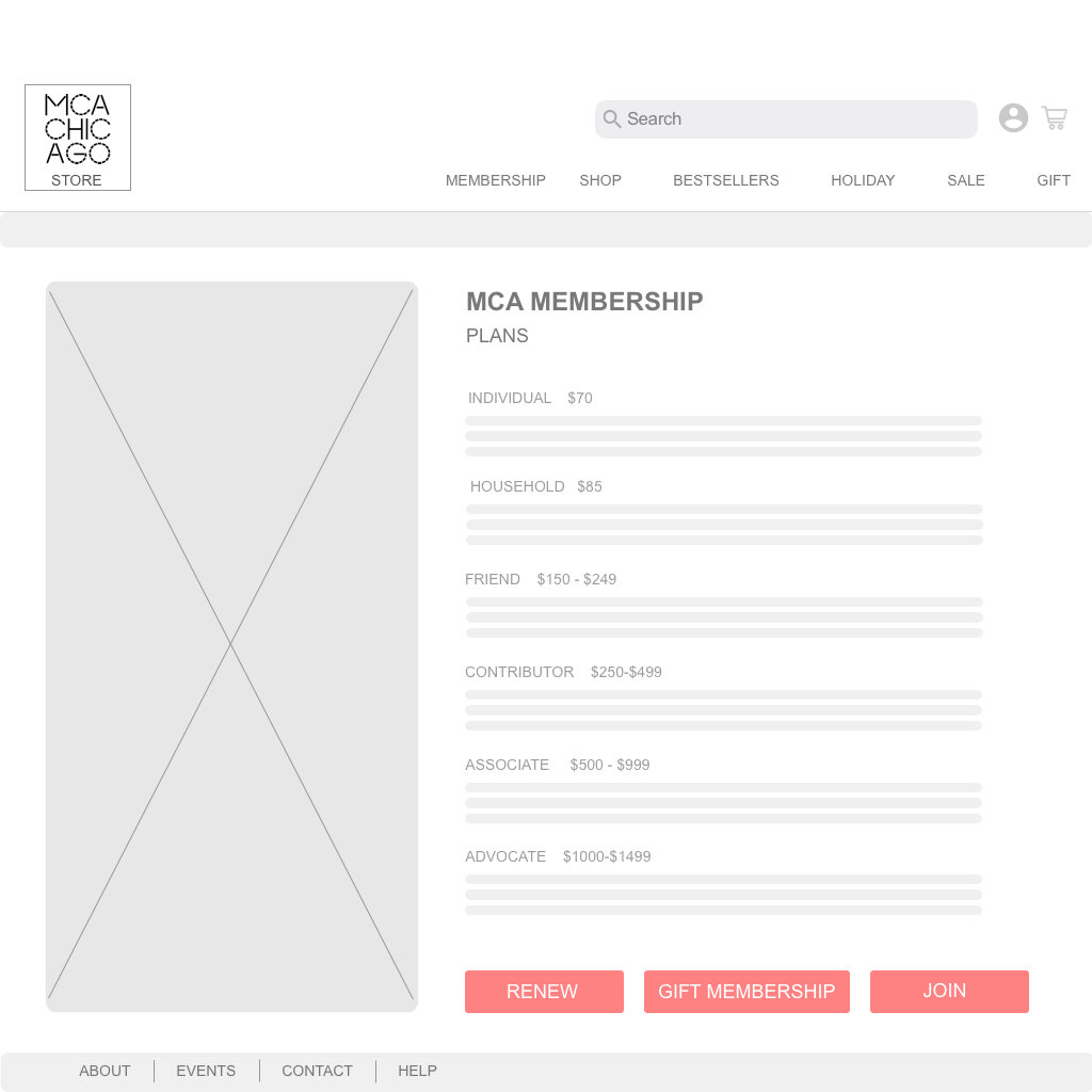
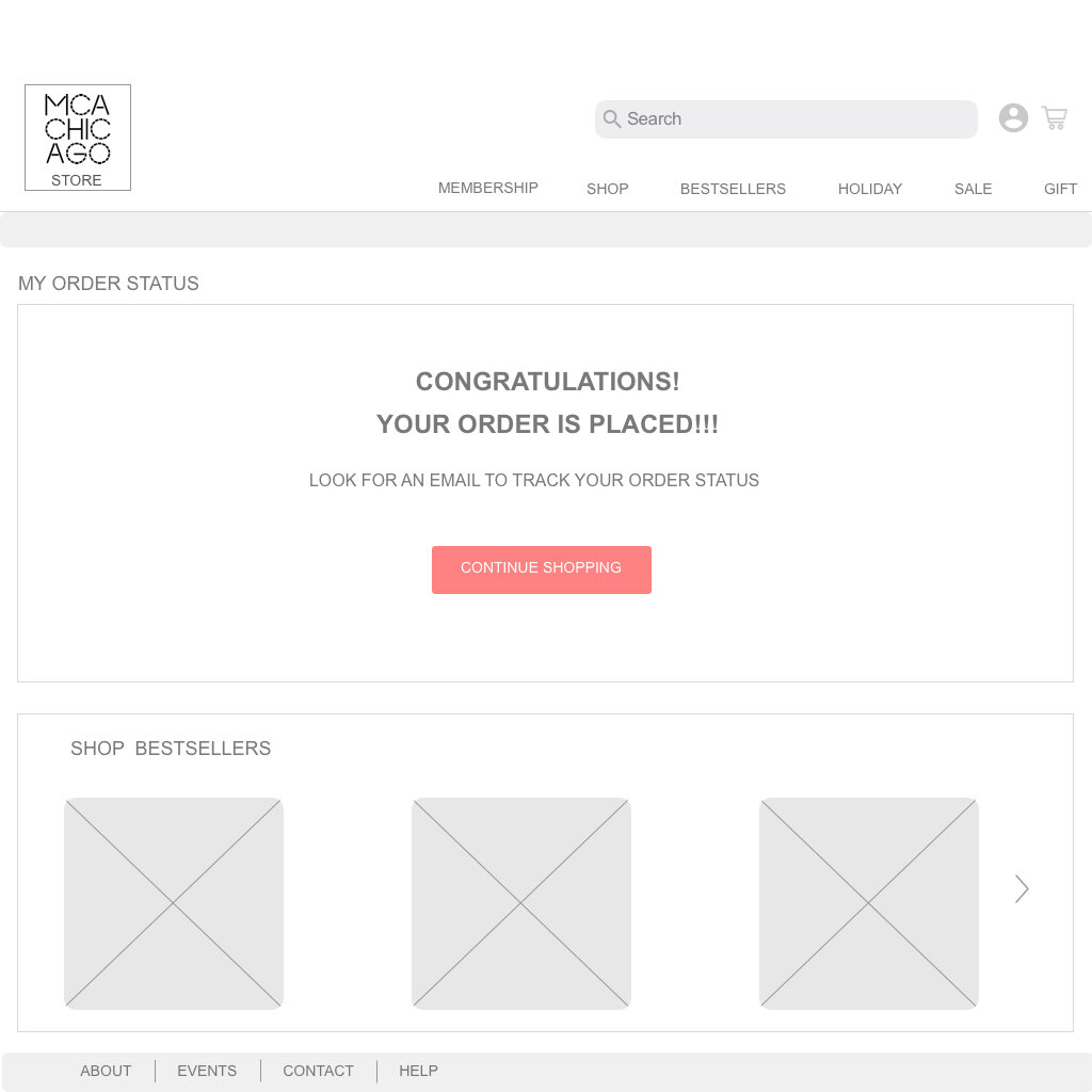
Wireframes
Usability Testing Insights
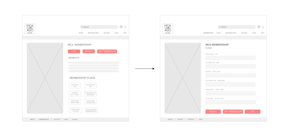
The users were not able to figure out membership plans and how to join MCA.
The users wanted to have ”All Holiday” tab that lets them view all the sub categories within the Holiday Tab.
The users wanted to view all sub categories and filters while they are browsing.
The Order status page needed more details about tracking order.
The user wanted to see the product details once they click on Product.
The Gift sub categories were confusing to the users.
The Cart status should be updated automatically once a product is added.
The Interface of Gift Wrap Popup was confusing the users.
The Membership Plans page confused the users to take the right action.
The User wanted to see store pickup as an addition to shipping.
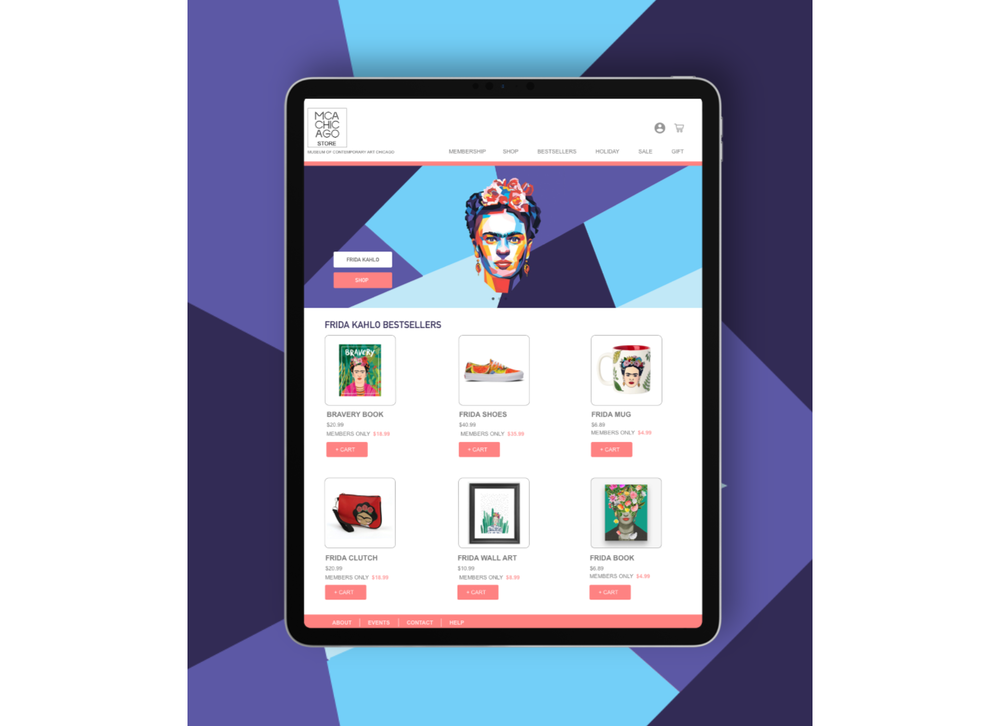
Iterations
