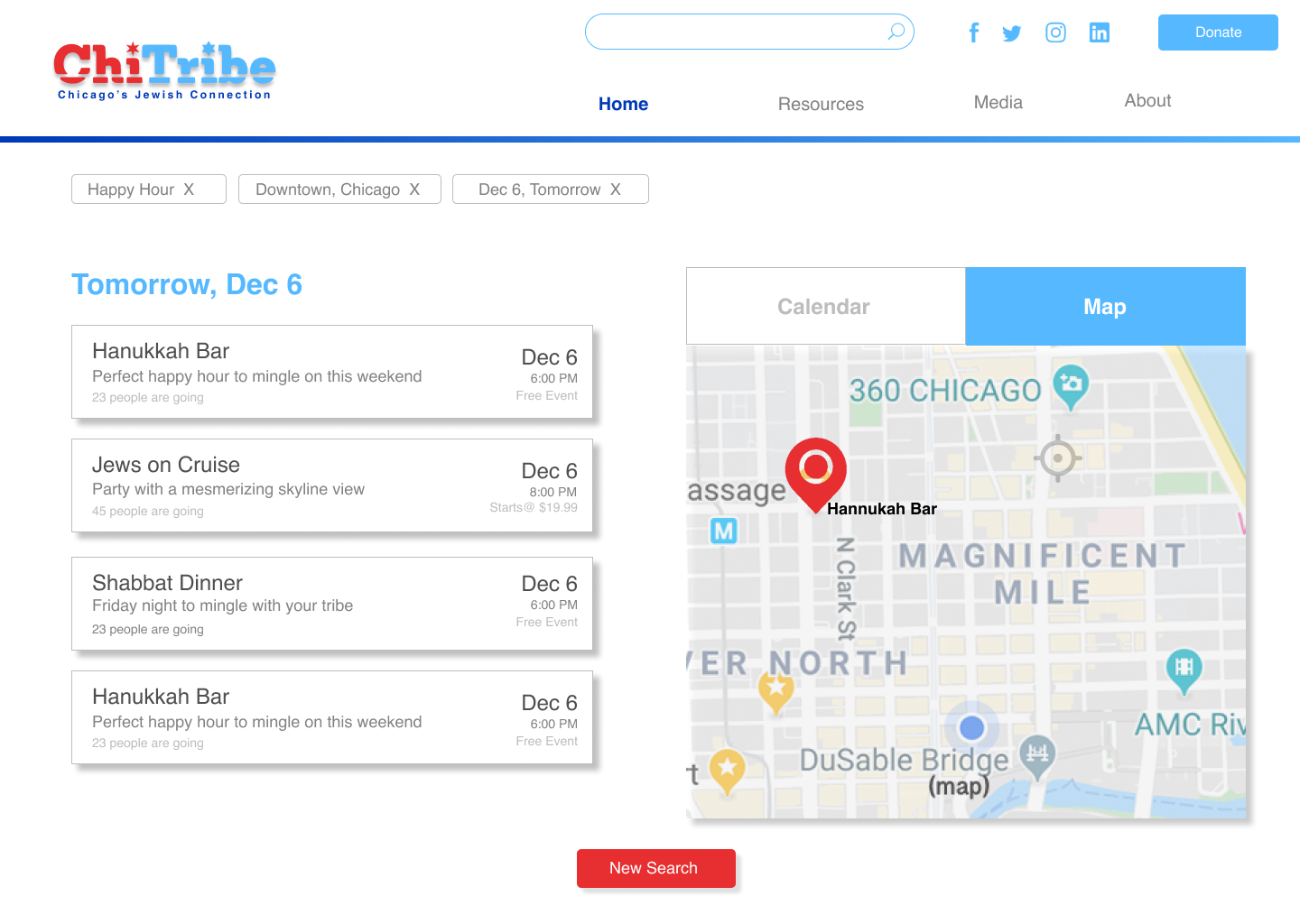
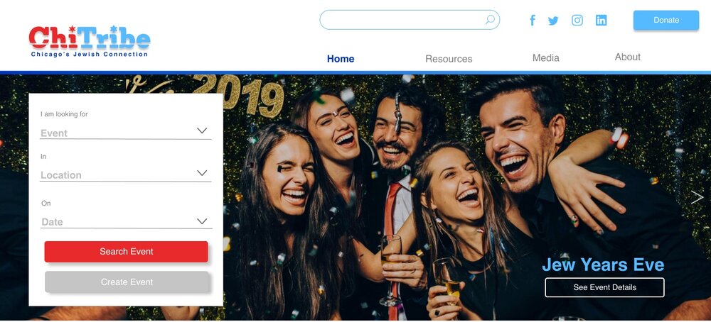
This project has the goal of reducing high (80%) user bounce rate on the Chitribe website. Chitribe is a Chicago based online service that is used to organize events for Jewish people in the city with similar interests. The project features new landing pages, revised site map and global navigation , redefined CTA buttons and central Jewish calendar. The process involved intensive research and interviews with the end users to identify opportunity areas.
Duration: 1 month
Tools: Figma, Adobe suite
Deliverables: High fidelity Prototype for Responsive Platform
Methodology: Task Analysis, Heuristic Analysis, Competitive Analysis, Usability testing
DISCOVER
Research: Surveys & Interviews
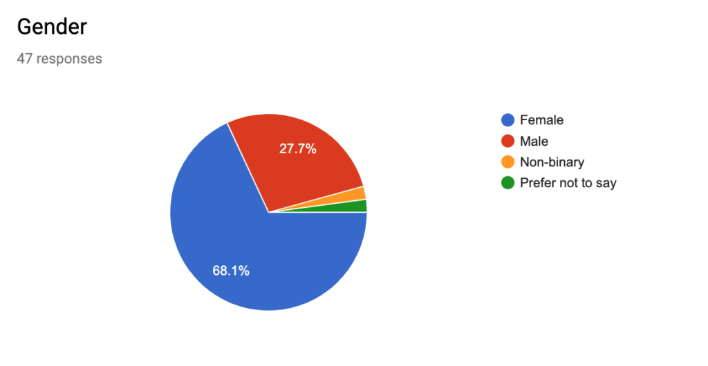
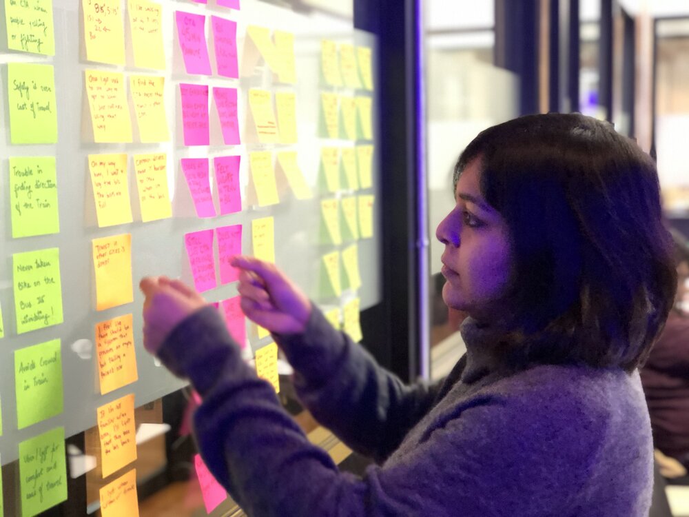
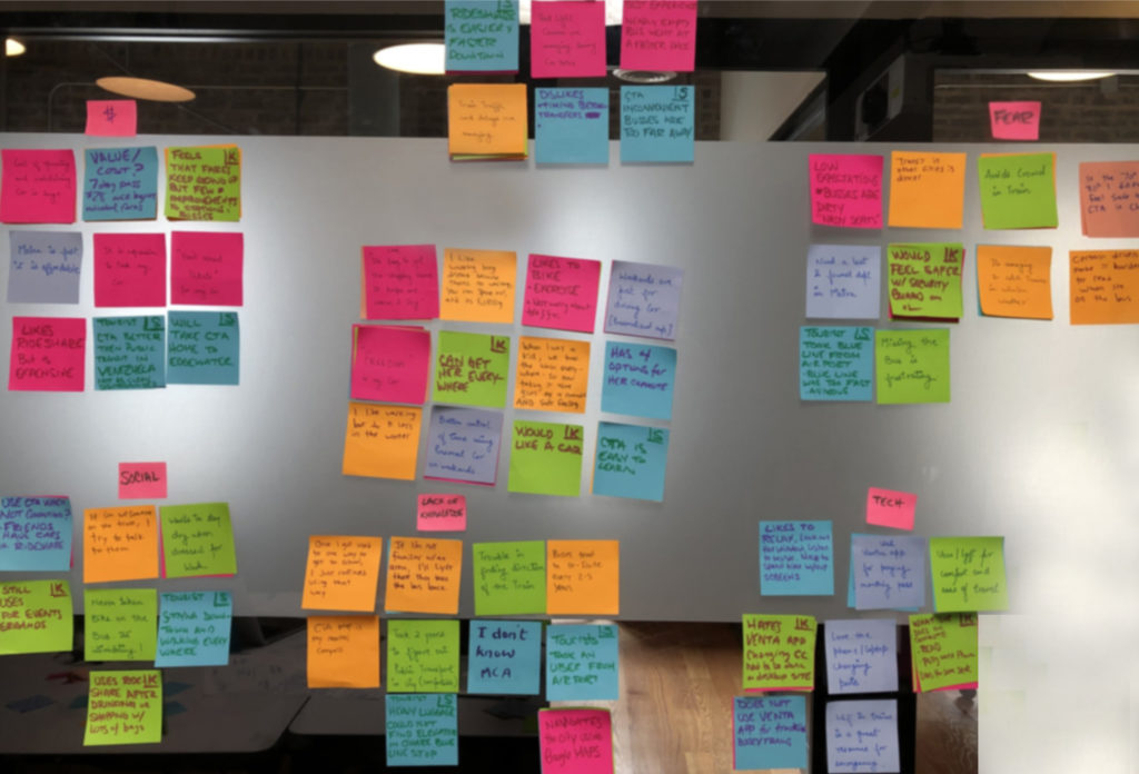
WeI started the research by first creating a screener survey with few questions about the Jewish community in Chicago. We then distributed it through different social mediums to gauge responses from different age groups. We got about 47 survey responses, 5 Task analysis and 10 interviews. The data that we received was really insightful. The true insights and information from interviews helped us find patterns through Affinity Diagramming
Survey Insights
●Most of the users that responded to the survey were early and late millennials.
●Most of the users that responded to the survey were mostly women.
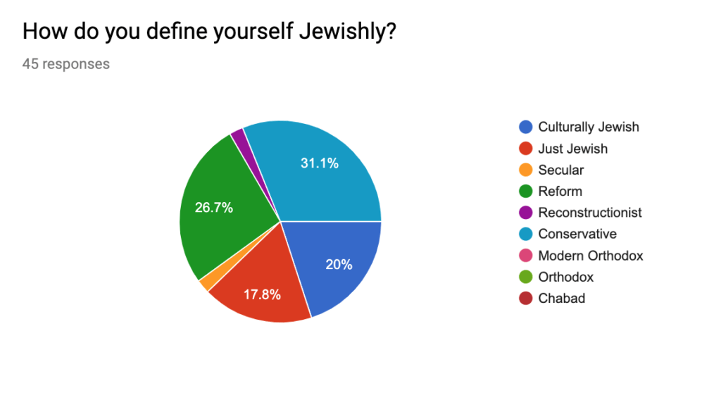
●Most users identified as culturally Jewish or secular, Reform, or Conservative.
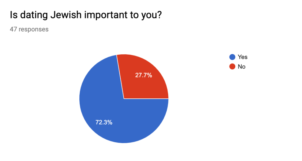
●Most users indicated that dating Jewish is important to them
●Most users were looking to make new friends or romantic partners, and to have fun
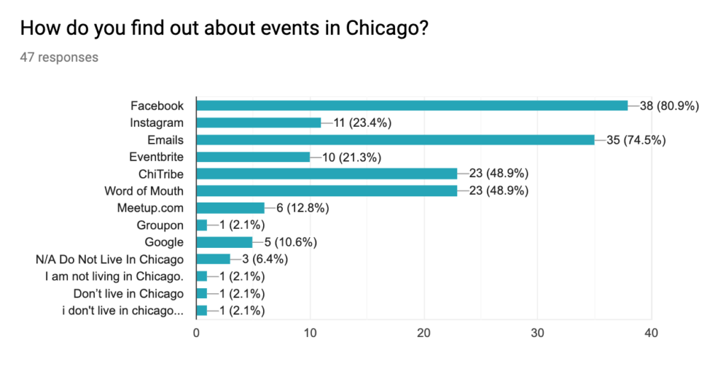
●Most of the users use social media to find events
●Most of the users are attracted to no/low cost events
●Most of the users are unaware of Chicago Jewish Guide
Interviews
Following our initial research, we recruited 10 interviewees from our screener survey
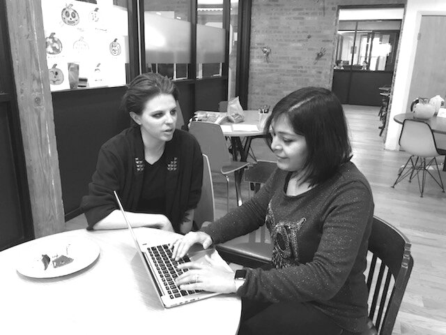
Sample Interview Questions
●How do you keep up with Jewish life in Chicago?
●What would you like to see to help keeping up-to-date ?
●How do you connect to peers in the Jewish community?
●Why is being involved in Jewish life important to you?
●What kind of events appeal to you?
●What do you look for in an event? What makes you want to go to an event?
Task Analysis
Task Analysis is a simple exercise to evaluate the information architecture and navigational structure of the current site. We did a Task Analysis where we developed three user flows – asking users to find an event, make a donation, and listen to a podcast. This helped us not just in identifying the opportunities to improve the user experience, but also to generate some preliminary ideas as to how we might approach these challenges. We recruited five users and asked them to perform the user flows as well as give us their initial impression of the website.
Existing Website Strengths
●Logo of ChiTribe looks good, users appreciated stars and colors.
●Person of the week is interesting feature to read about.
●Podcasts location is intuitive when given prompt to find it.
●Mobile site is better organized than desktop website.
Lemers Usability Insights
To contextualize the results from Task Analysis, we categorized feedback under the groups of Learnability, Efficiency, Memorability, Error Management, and Satisfaction. These categories are part of Nielsen/Norman’s heuristics framework, which help guide the evaluation of how learnable a website is for its users.
Learnability
●Site purpose and functionality is relatively straightforward
●Donation page confusing
Efficiency
●Navigation structure could be improved (Support link?)
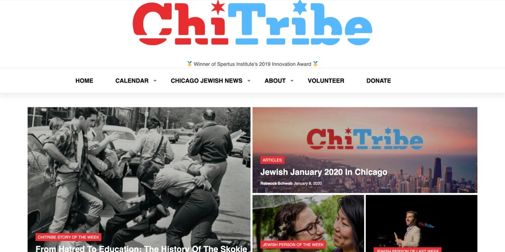
●Users found overall appearance somewhat “busy”
●Two areas for calendar confusing to users; sidebar is “distracting”
Memorability
●Users found accomplishing tasks somewhat difficult due to so many options
●Event calendar display is complex
●Presentation of podcasts is confusing
Errors
●Users trying to add calendars would go to Chicago Jewish calendar or click on words like “calendar” or the day listing
●Inconsistent fonts are confusing
●Users want to click on images
●Couldn’t find podcast
●Hover state in calendar is confusing, can block functionality
Satisfaction
●Looking for a tab to register
●Could not find tickets for events
Affinity Diagram
Data Synthesis
From our interviews, we identified the following patterns:
How people find their events
How they stay informed and stay connected to their community
What they don’t want in the events
What the community needs
How they celebrate their heritage
What they do in their free time
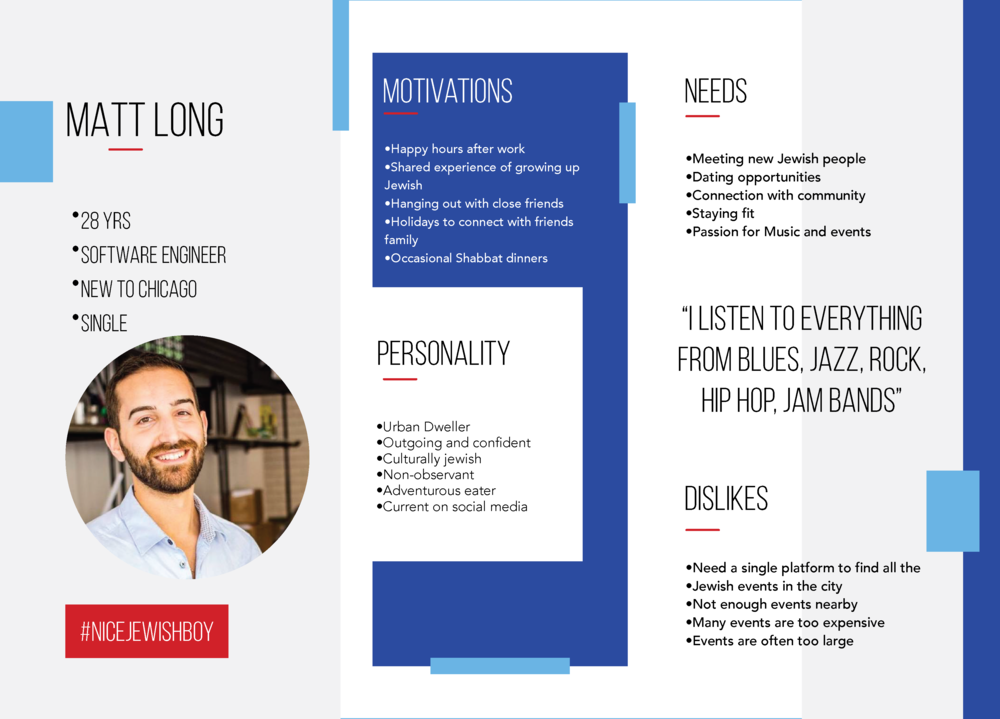
From these responses, we were able to identify themes and threads that we would weave into three distinct user personas to help guide our problem and solution statements.
Competitive Analysis
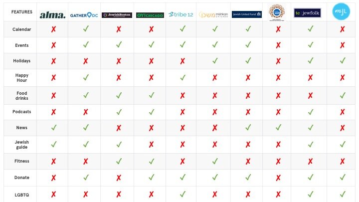
Insights
Most sites in the Jewish space centered around calendar function
Most sites focused on events for building Jewish community
Only a few sites highlight Jewish Holidays
Happy hours are not promoted by most sites
Food and drinks is a potential content strategy to connect with audience
Podcasts not featured on most sites; large potential given growing popularity
Jewish Guide is featured on some of the sites
Very few websites feature fitness, which is a growth opportunity
All the websites have Donate button on the top of the page
LGBTQ could be a potential area to gain young millennials.
Dating/ finding partner/friends is a feature on most of the websites.
DEFINE
Problem statement (user)
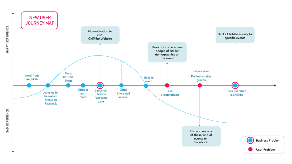
The Jewish people in Chicago need one stop shop to find about Jewish events and information in the city. They need a way to connect and create a community with Jewish people with similar interests.
Problem statement (business)
ChiTribe is a Jewish community website that needs Jewish people to connect with similar interests. The business needs a way to reduce the bounce rate of the website visitors and engage them more in the ChiTribe events.
How Might We…
How might we create a platform for Young Jewish people in Chicago in order to actively engage them?
How might we connect Young Jews in Chicago with similar interests?
How might we create a Jewish event based platform for people in Chicago?
Personas
User Journey Map
DEVELOP
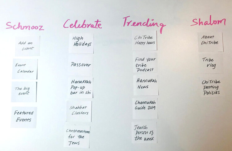
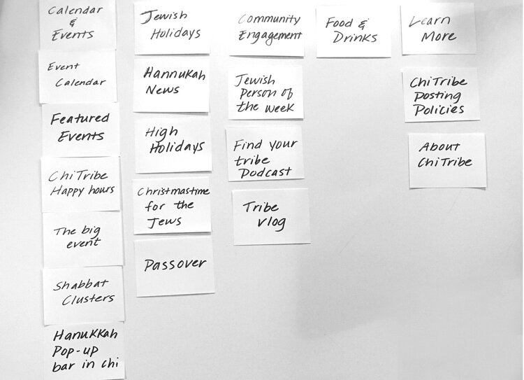
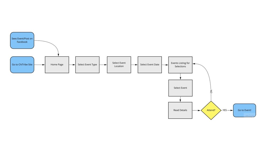
Information Architecture: Defining User Flow
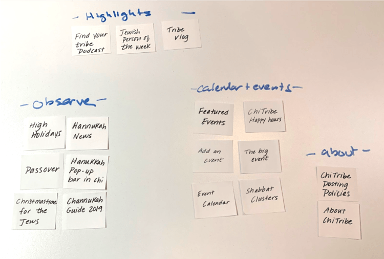
Open card Sorting
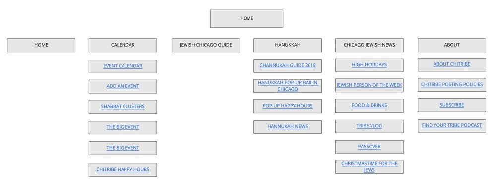
Existing Site Map
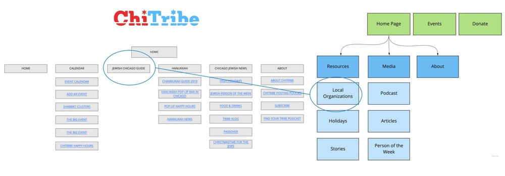
Revised Site map
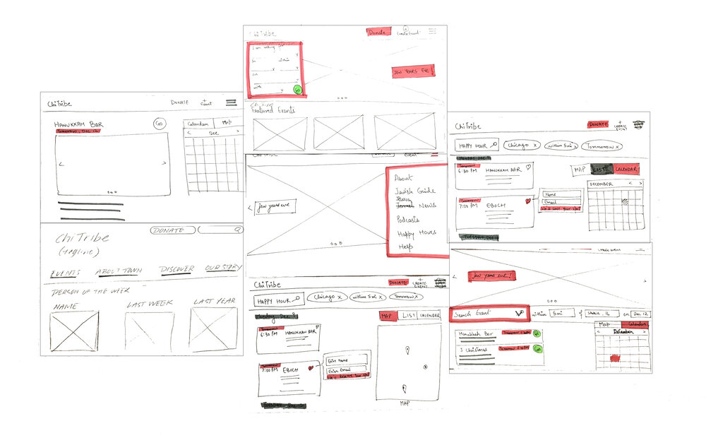
Sketching
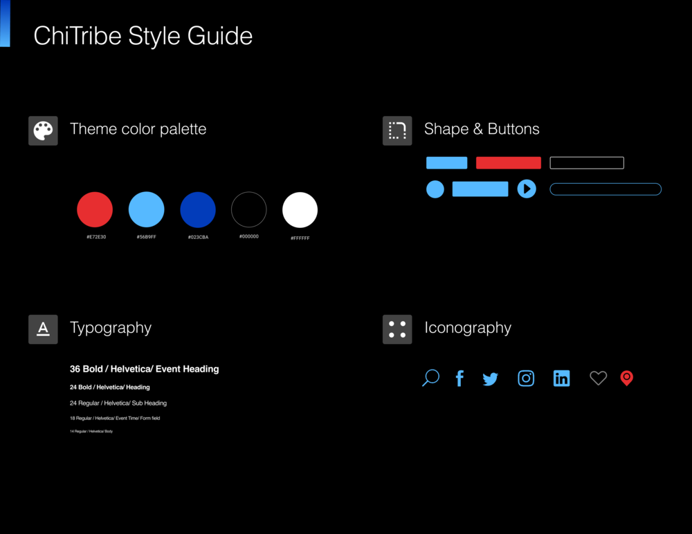
UI style guide
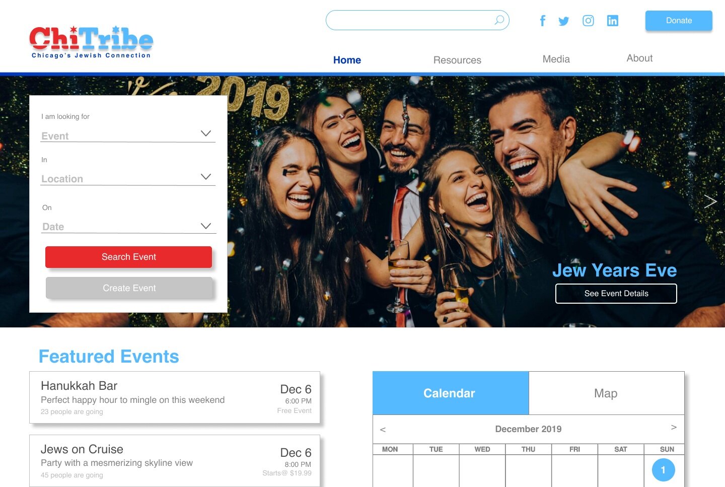
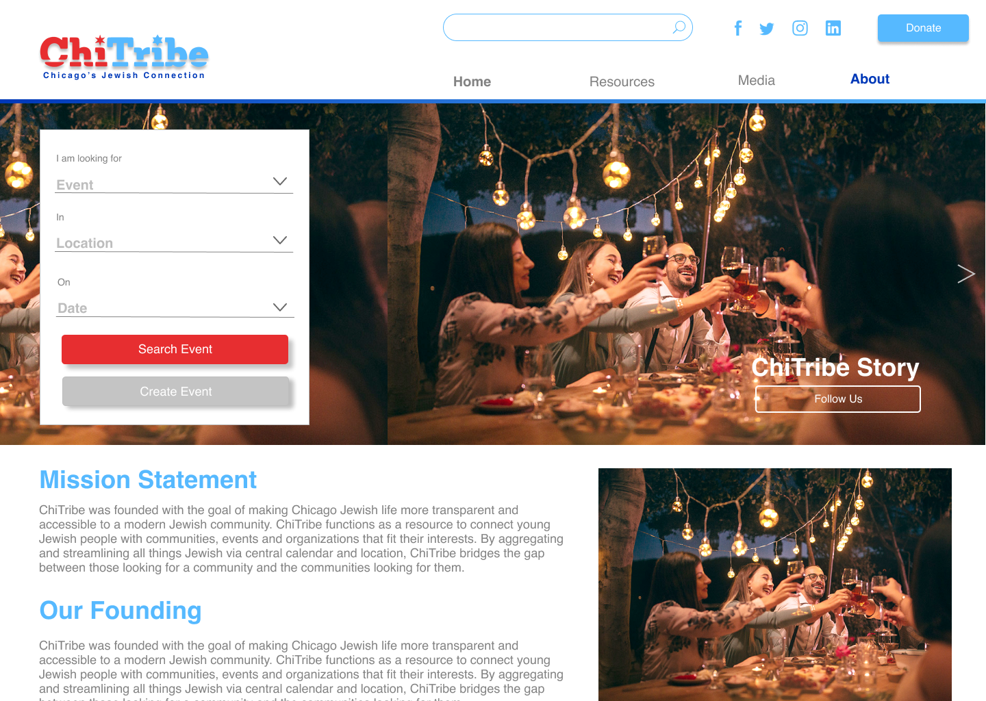
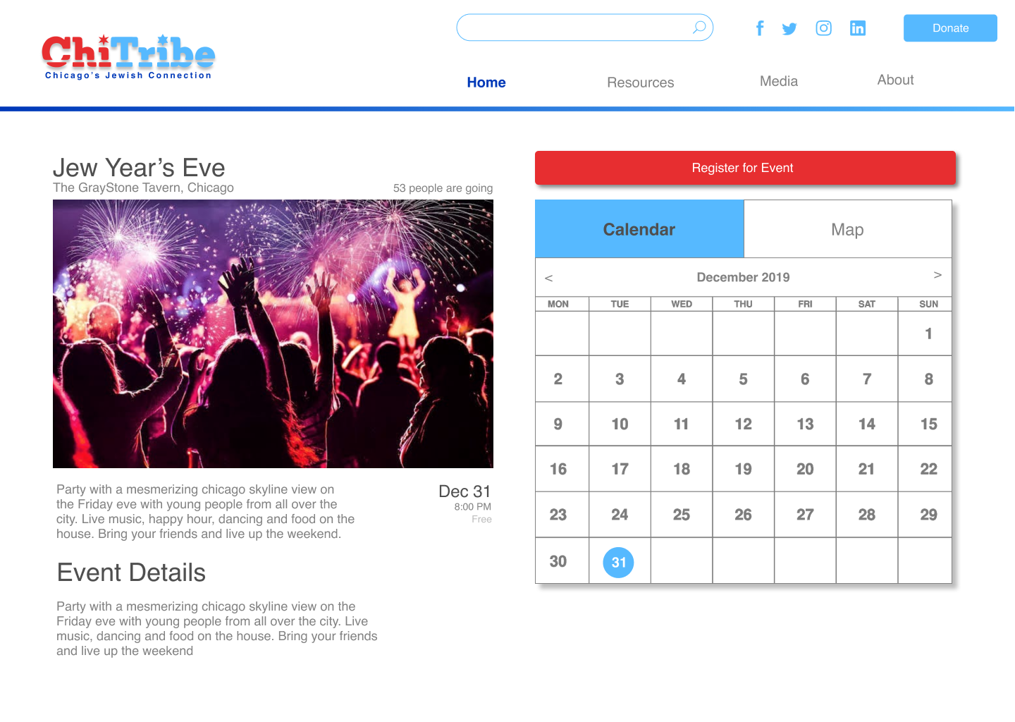
Hi Fidelity Mockups
DELIVER
Usability Testing
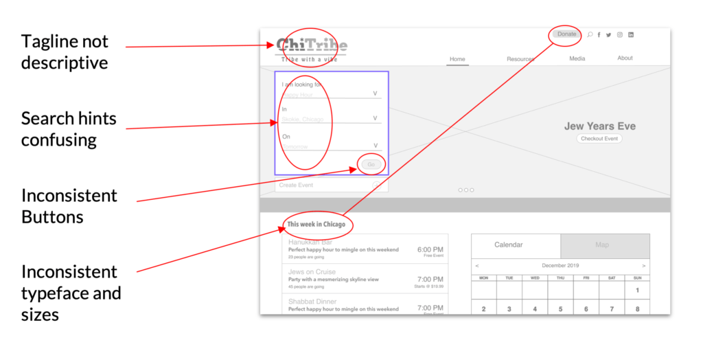
Iterations
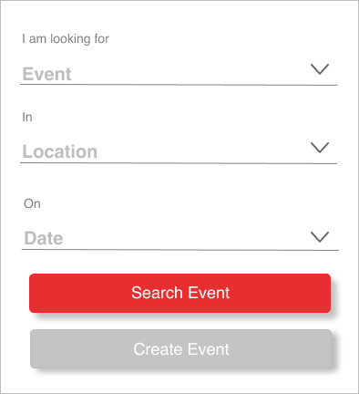
Search Box Iterations
The search cues were made more intuitive .
The buttons were made more consistent.
Search event tab is turned into a CTA button.
Create event Tab was changed to a secondary tab.
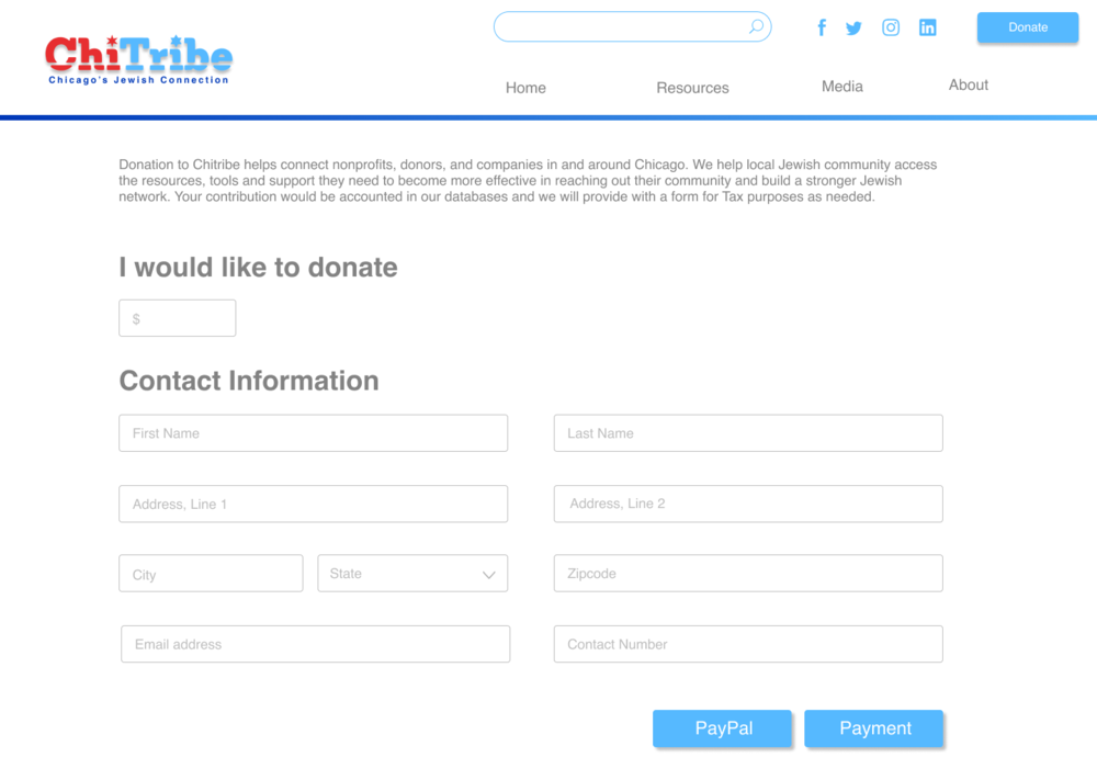
Donate Iterations
There was content added on the top of the page about donation cause.
The type fields were made relative to the items .
The payment and paypal were given two different tabs since they function differently.
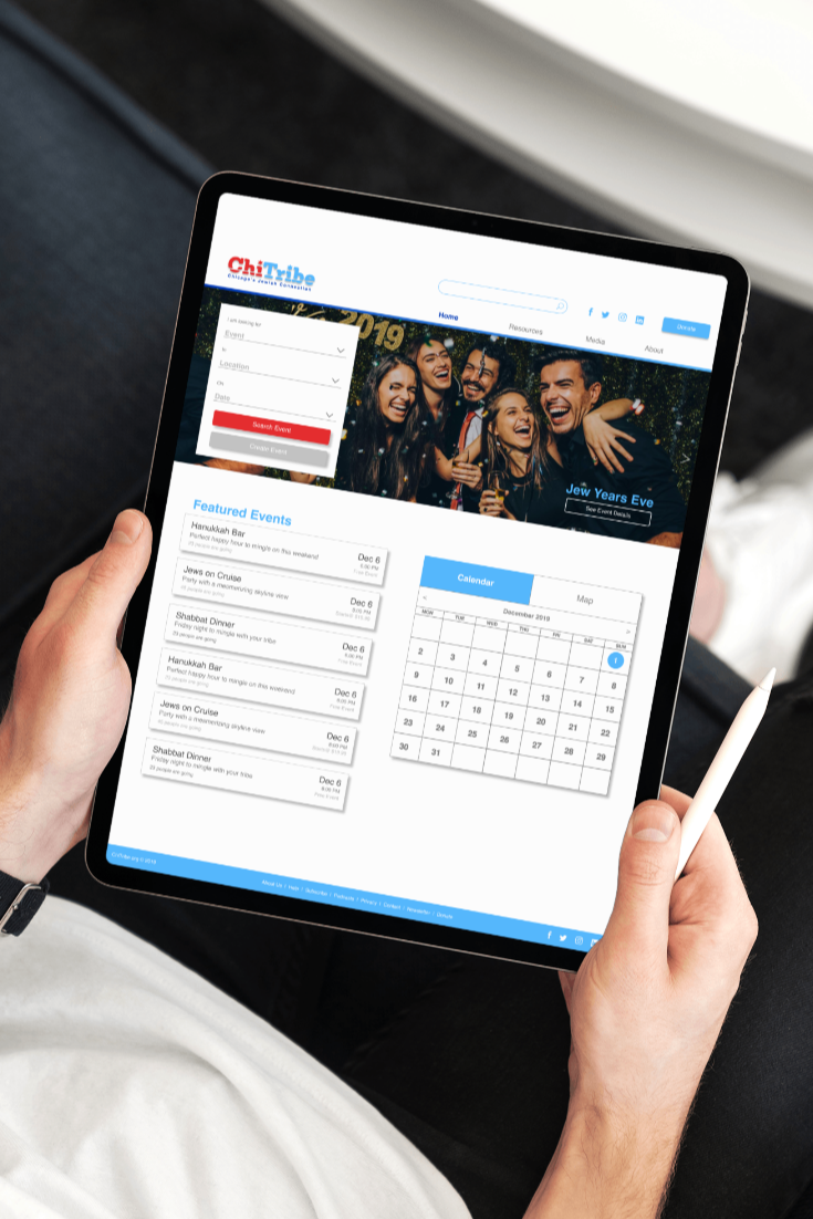
Retrospective
The ChiTribe website had a high user bounce rate of about 80%. To understand the problem further, I started doing the interviews and research. I gathered lots of insights about the users and collected feedback about the existing website after conducting task analysis and heuristics evaluation.
With all the data collected, I defined the problem was the landing page of the website which had a lot of information but no Call to Action button. The absence of CTA button made the user lost on the website. No CTA buttons caused high user bounce rate on the website because users didn’t know exactly what to do when on the website.
In order to bring down the bounce rate, I came up with few strategies. First strategy was to redefine their Information Architecture and come up with a new content strategy. The other strategy was to provide 2-3 definitive CTA buttons on the landing page to provide guided navigation to the user. The third strategy was to give user a visually delightful experience by having pretty pictures for each content posted on the website.
These 3 strategies were really effective in engaging the users at the landing page and becoming active members of the ChiTribe community. The reduced user bounce rate was the success metrics that allowed me to further design better experience for our users.
