CTA App for reliable public transit experience
This project aims to improve the digital platform of CTA in order to increase the ridership of their services during peak and off-peak times. The main goal is to decrease traffic congestion on the road and to increase their own revenue. The result would be a win-win for all, residents, visitors, businesses, and the city itself.

Duration: 2 week design sprint
Contributors: Lynnette Colombo, Thomas Stern
Tools: Sketch, Invision, Adobe suite, Figma
Deliverables: High fidelity Prototype for mobile App
Methodology: Interviews, Empathy Map, User Journey, Usability Tests
DISCOVER
THE PROBLEM
“Unreliable schedule, crowded and I have to pay in cash”
Yes thats how people describe CTA, the public Transit system of Chicago. About a million and a half riders use CTA everyday within the city and 35 adjoining suburbs. But over the years, users have shifted to other commute services pretty rapidly that are more reliable and time efficient.
The biggest challenge facing CTA is to retain their existing user base by improving their services and overall experience. We identified the underlying problem is that the users lack confidence in the CTA services and lack credibility against time. As a result, users often rely on other commute services that gives them more confidence in their arrival times and a better travel experience.
DESIGN HYPOTHESIS
CTA believes that by improving their digital offerings via Mobile app could lead to quick-win improvements for residents, visitors, businesses, and the city itself. This would be true for users when they will feel safe on CTA, rely more on CTA schedules, seamlessly use digital ticketing feature & rely more on CTA alerts for their commute.
The same will hold true for CTA business when they’ll be able to manage city crowd, receive bigger budget to make further improvements, perform more frequent maintenance.
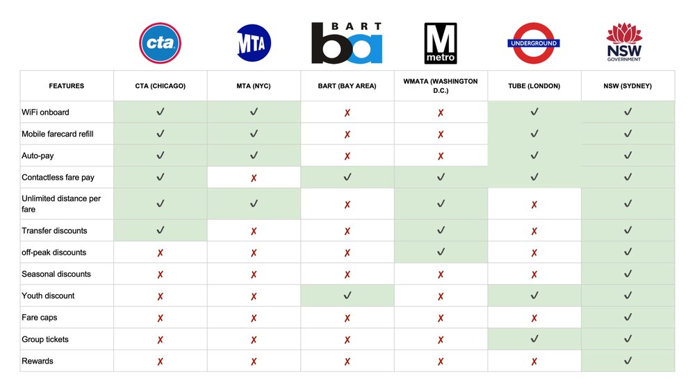
COMPETITIVE ANALYSIS
First I looked at some competitors and Public transit in other cities. There are a lot of things that the CTA does well and also some areas of improvement. By looking at other ways to get around in the city, I understood that convenience and trust in the system are something that will benefit our client and our user.
SURVEYS & INTERVIEWS
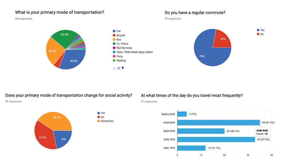
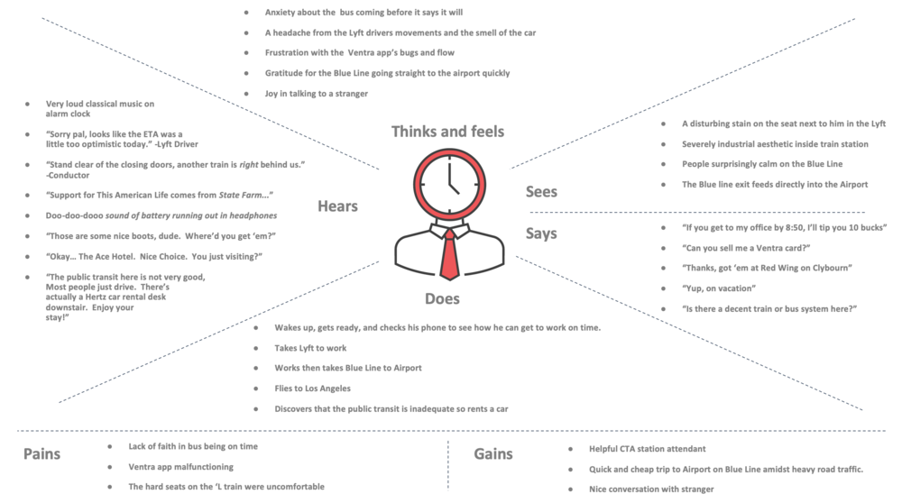
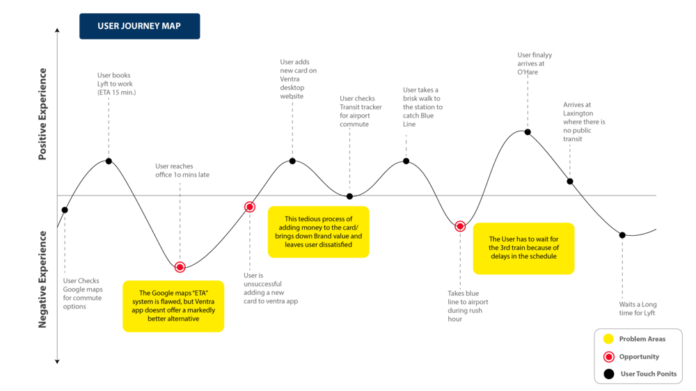
In order to understand the bigger picture, I dived deeper into the discover phase and got 60 survey responses, 2 contextual inquiries and 10 interviews. The data that I received was real gold. The true insights and information from interviews helped me define the Target user. Further I developed journey and empathy maps to interpret users experience in and around CTA service.
DEFINE
DATA SYNTHESIS
With great number of interview responses and contextual inquiries, I was able to gather solid information from the users. I started putting down the responses on sticky notes and put them on a wall.
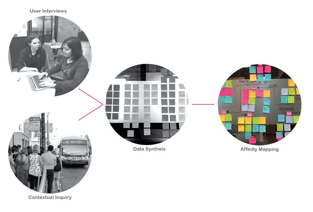
Then I started with Affinity diagramming where I spent half a day in finding those patterns within this large amount of data and was able to identify 4 key connections:
MOTIVATION: Time and Money
PAIN POINTS: Unawareness and Social Connectivity
GOAL: Control on Time and Safety
BEHAVIOUR: Tech Savy
TARGET USER
What matters most: Time, Value, Confidence in products
● Tech savvy and an early adopter
● Highly values their time
● Chooses fastest commute options
● Willing to spend money on convenience and safety
● Anxious about being late and getting lost
● Enjoys instant gratification
● Tries to maintain a healthy lifestyle
EMPATHY MAP
USER JOURNEY MAP
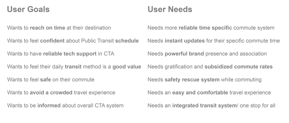
GOALS vs. NEEDS
DEVELOP
DESIGN STRATEGIES
I came up with multiple design strategies for the Mobile App in order to improve the overall Public Transit Experience as per the research and synthesis. But some of the key strategies are:
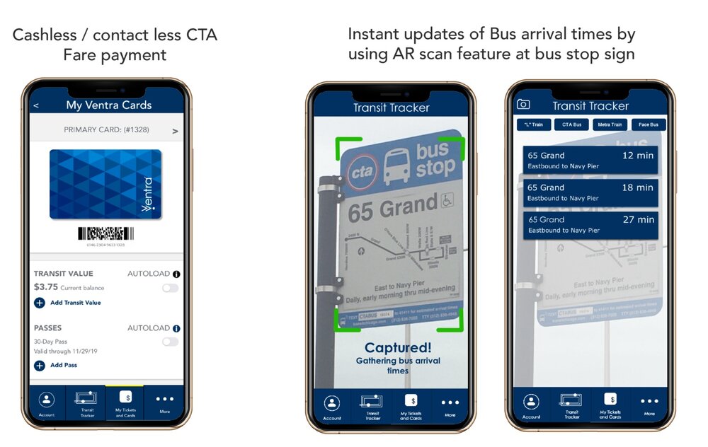
1) Digital Card/ Cashless transaction for a seamless Ticket buying experience.
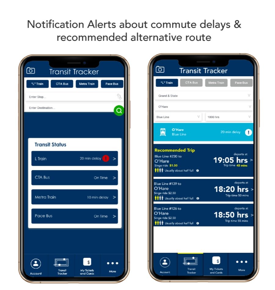
2) Integrating Bus/ Train and Metra notification Alerts to have clear info about specific delays in public commute system.
3) Using Augmented Reality in order to provide live/ instant updates of arrival times by scanning the QR code at the bus stop sign.
4) Managing crowd by lowering Off peak hour prices & informing via app.
5) Providing rush hour information via Crowd infographics in the app for a comfortable and safer commute.
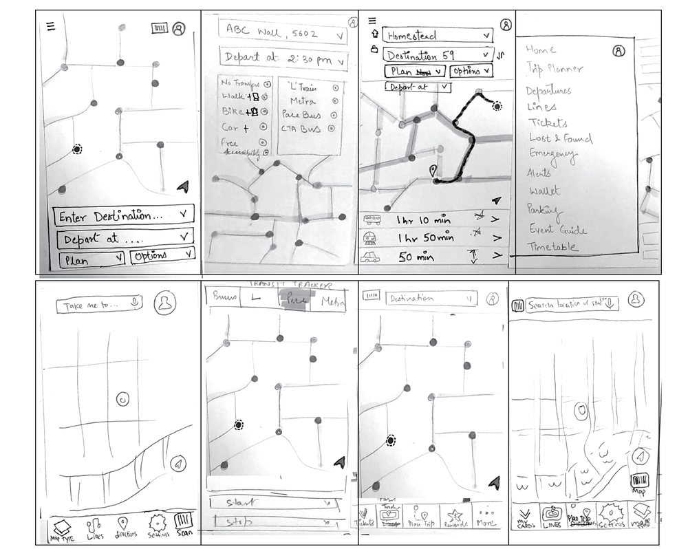
SKETCHING
Sketching, I believe is vital to the design phase. It allowed me to explore all the possible strategies visually. The crazy 8’s quick sketching pushed my design senses to evolve better ideas rapidly. This exercise helped further in defining the user flows step by step.
WIREFRAMES
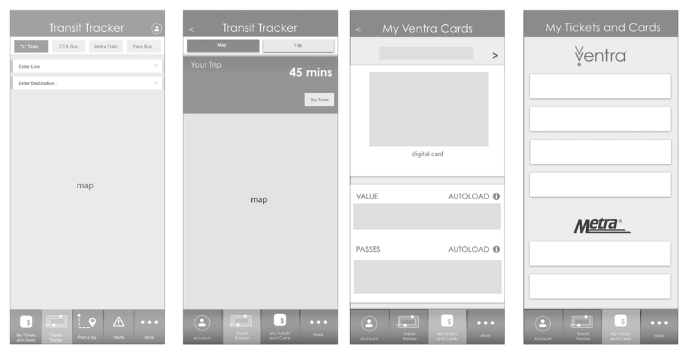
FEATURE MATRIX
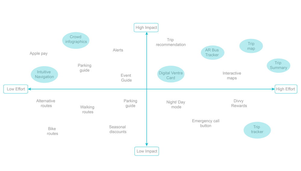
Feature Matrix helped in prioritizing the important features for the digital app addressing the user goals and needs. This matrix gives a visual clarity of how many features could be prioritized over others.
DESIGN FEATURES
DELIVER
USABILITY TESTING
- Looks like Google Maps. Wants to see nearby stops o the map.
- Did not want to take the route that had an alert. Expects to see alternate/recommended routes for delays.
- The first alert was on a train line that the user was not interested in. Too much irrelevant information.
- CTA maps were confused with google maps and users wanted to see nearby stops interacting on the map.
- Users would expect to see route highlighted on the map.
- User could not figure out how to plan a trip
ITERATIONS
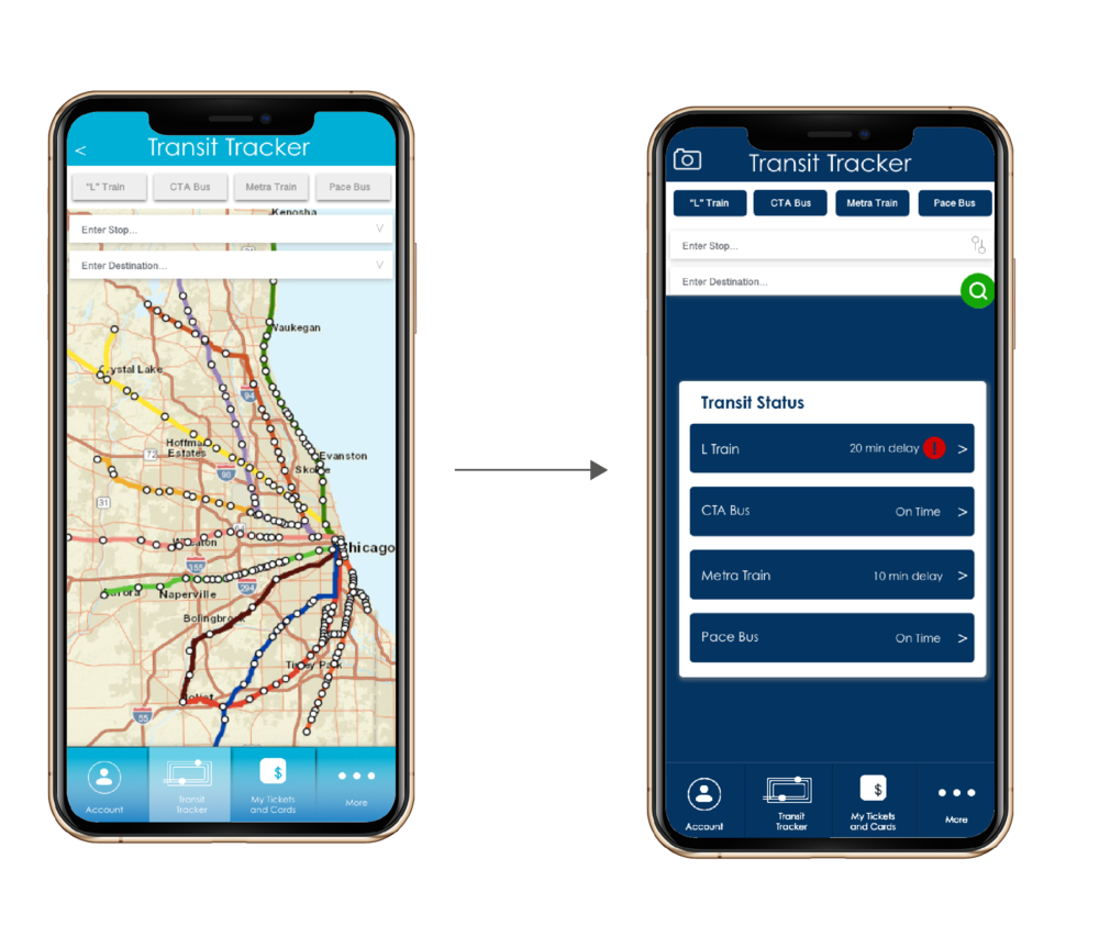
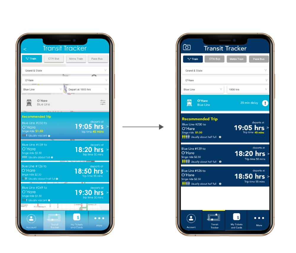
After the usability testing, The iterations were done on High fidelity wireframes.
1) One of the major problems faced by users is the public transit delays. To address the delays, the app will provide alert notifications to the user about their everyday commute.
2) Another iteration was to work on visual hierarchy in the screens to provide easy and intuitive navigation to the users.
DELIVER
REFLECTIONS
- The app provides a more holistic experience to the user while he is commuting.
- The AR feature lets the user check the upcoming bus arrival times instantly while waiting at the stop. It is a quieter way to inform users that their bus is arriving and simulates brand loyalty.
- The integrated CTA alerts lets the user find about their commute details in a more intuitive way that gives him more satisfaction.
- The crowd infographic and lower price is a strategy to manage the peak hour crowd that helps the system in managing the rush hour .
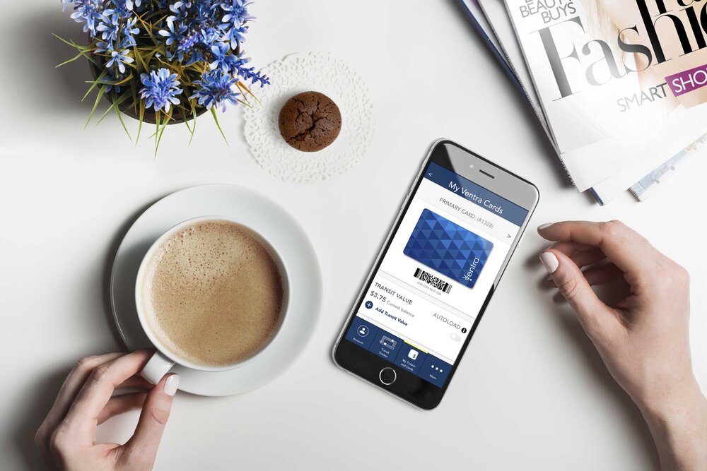
- The digital ventra card would let users pay through their phone providing a seamless commute experience to them.